Skyrim UI Redesign
My Role
All of it!
Time Frame
1 Week
Problem
Skyrim currently utilizes a list format for the inventory which can lead to excessively long lists, hard to maneuver inventories, and removal from game immersion for the player.
Solution
Create a new Skyrim UI that utilizes a newer inventory navigation system and creates an overall better user experience with the game.
Inspiration
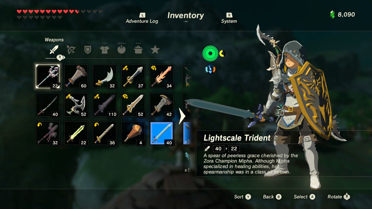
Using some very light research I asked some people in the gaming community what were some of their favorite inventory systems in recent years. A game that came to mind to most people was The Legend of Zelda Breath of the Wild. This inventory utilizes a grid format to display items and a quick weapon changing system. Below you will see examples of the Zelda inventory.
Here we can see the weapon inventory page for The Legend of Zelda. It uses a grid system and image icons for the items to organize the inventory. A small description pops up on the right side when an item is selected with the cursor. Blue is used to denote that an item is equipped.
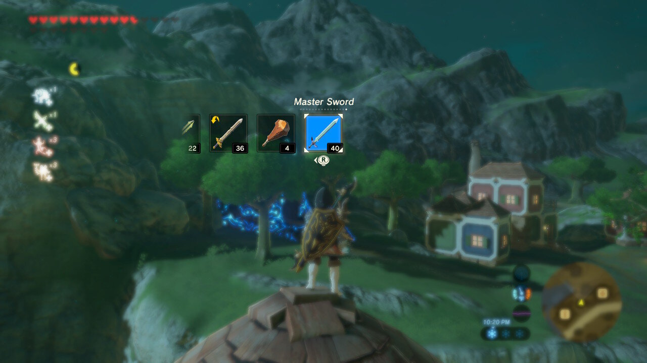
Here we see the quick weapon change feature that Zelda utilizes. This feature allows the player to quickly change their main weapon, shield, bow, and arrows that they are using. By allowing players to do this they have full access to their entire weapon options without needing to remove them from the game experience. This ensures that player immersion is not lost for inventory organization.
When looking at the Breath of the Wild UI system it became clear to me that the quick changing weapon feature was a definite need for Skyrim. By utilizing a system like this it would allow players to quickly change their style of play without needing to fuss with a long list of items. Skyrim allows for this freedom and flexibility with the way their skill system works, so why not encourage this flexibility when it comes to inventory management? Additionally a grid system for the inventory would allow for an easier overview of your inventory instead of a long list of items that utilizes names over visuals.
Skyrim Original Design
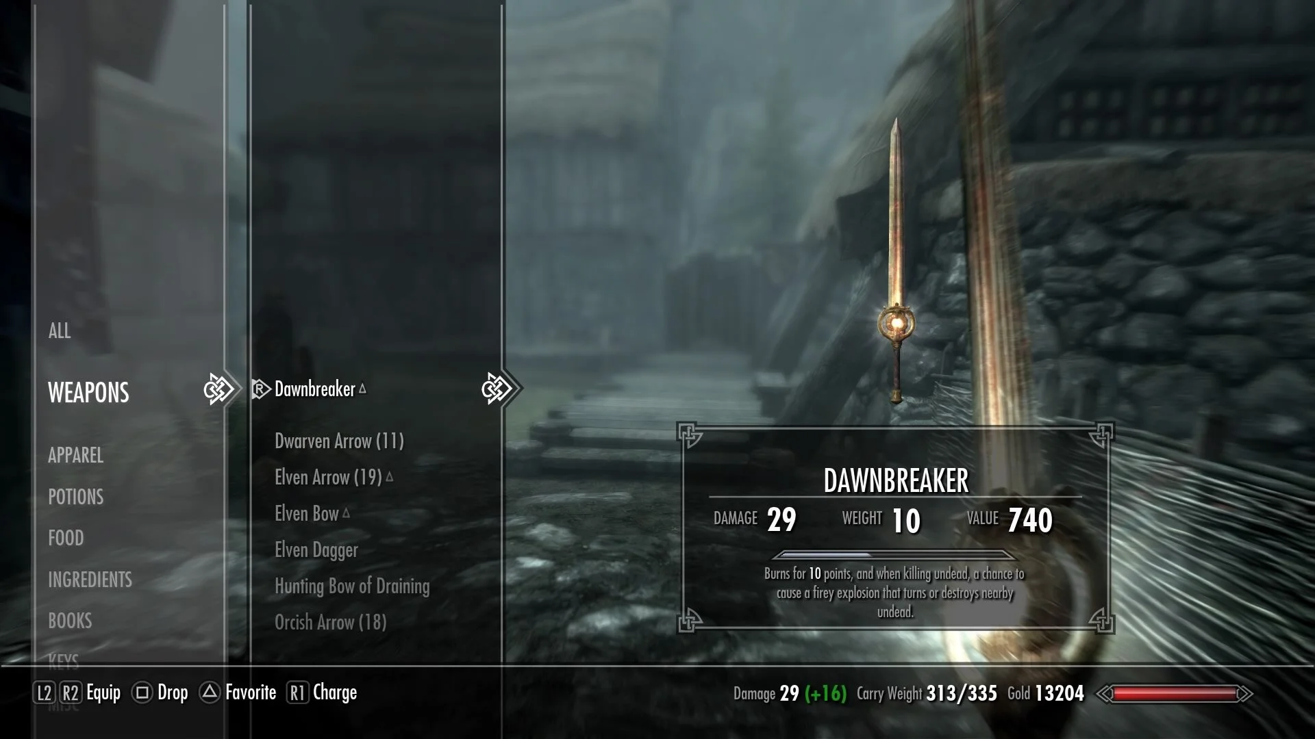
Below you will see images of the original Skyrim UI design. When speaking with people in the gaming community it was stated that this inventory didn’t make much sense. As far as design conventions within video games, the Skyrim inventory system takes a turn away from this. Bethesda does this with both of their major franchises, Fallout and The Elder Scrolls. A list inventory requires more memory on what the name of items are instead of what they look. In a highly visual medium like video games, this seems like an odd choice. Perhaps this is simply a callback to traditional tabletop RPGs such as Dungeons and Dragons and Pathfinder.
This is the original Skyrim inventory. Here we have the weapons panel which holds everything from swords and shields, to arrows, bows, and even things such as shovels and pick axes. On the left side you’ll see the list of all inventory categories.
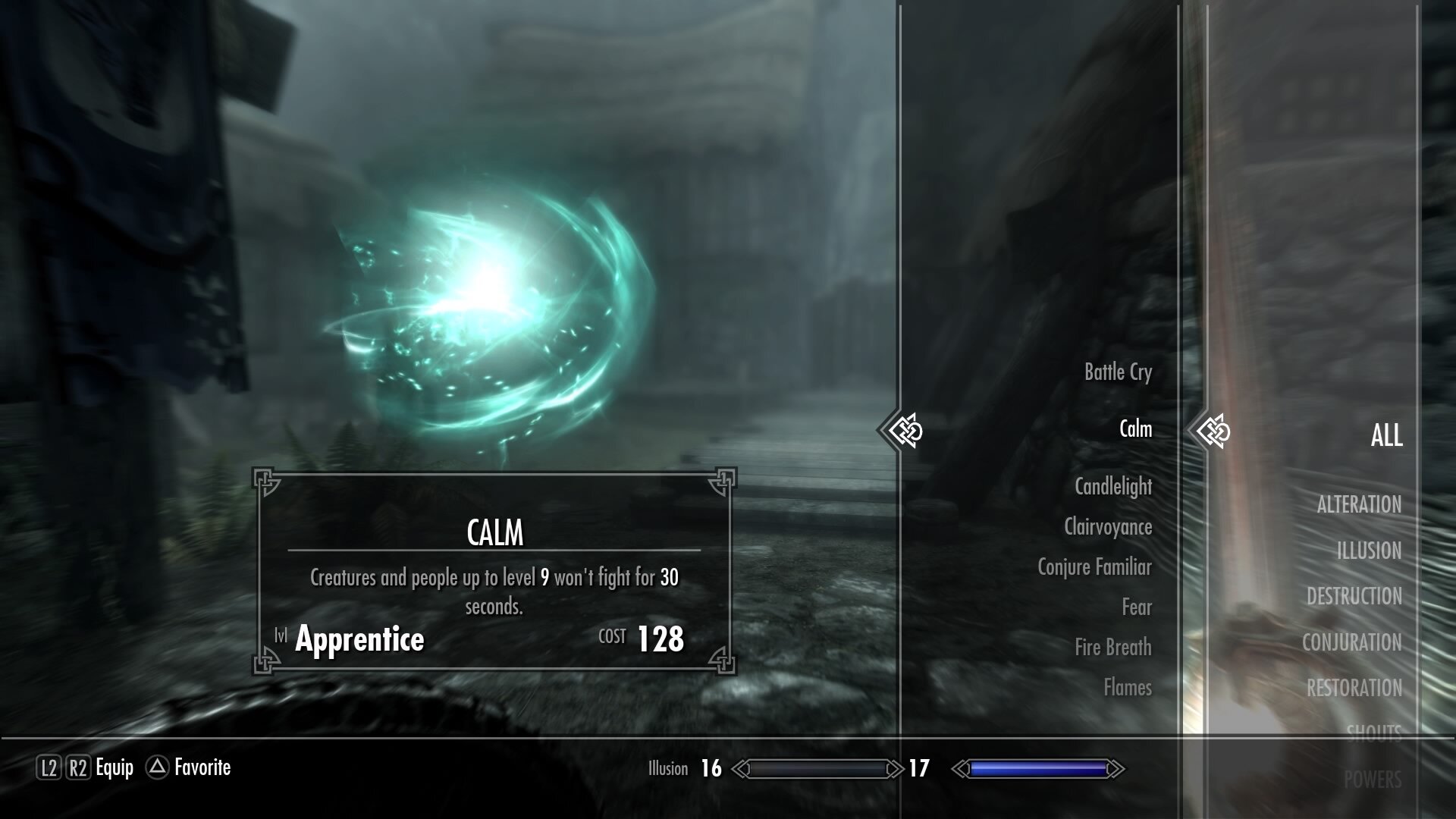
In this image we see that this list format is also utilized for spells in the game. While the list of spells can be rather long, a list format forces the player to scroll through everything in order to get to an item that is lower in the alphabet.
One of the positives to this inventory system is the alphabetical order of all items. Finding items isn’t really a problem as much as the time it takes to find those items. Finding an item becomes an issue though if you don’t know the name of the item. And if an item is lower in the alphabet then it takes time to scroll through a potentially very long list of items. Additionally this system does remove the player from game immersion.
The Redesign
I decided for this redesign to focus on taking the Skyrim system and changing it to be like The Legend of Zelda Breath of the Wild inventory system. The Zelda system allows for a more fluid change in important items such as weapons, and it allows for easier navigation of items within the main inventory screen. This would become a practice of taking a design and changing it to fit into the style of another game.
Here is the new Skyrim UI that utilizes a grid format and item icons. In an ideal world the character on the right would hold the item as you change your equipment. An additional benefit to adopting the Zelda inventory was being able to see your character as you make equipment changes. Skyrim allows you to create a custom character to play with, yet you don’t often get to really look at them.
This is the new spell inventory screen. This would force the players to consider more what the spells look like than what they are called. This is something that would greatly benefit from being tested. Would players be able to find spells as easily? If this inventory is changed to a text focused list again, what does that mean for the item inventory?
This is the implementation of the quick changing menu from Zelda. I added along the bottom some of the pieces of information from the original UI such as your damage, the ability to favorite and drop items, as well as your health. Players would be able to switch between swords, bows, shields, daggers, and all sorts of weapons utilizing this system. And they could do this without being fully taken out of immersion from the game.
A few of the quick change menu from first person perspective
Conclusion
This was an excellent exercise for me in doing a whole other style of game UI. So far I had fiddled with Animal Crossing and creating my own pixel art UI, but Skyrim is a whole different style. It became an exercise in taking the style set forth by the original UI and transferring it so I didn’t lose the important indicators in this new inventory system. If I had given myself more time for this project I would have liked to have tested it and gotten feedback from actual players of the game. What would they have thought of this change? Does this change actually work for Skyrim or does it only work for a game that was built around it like Zelda?
These are questions I have yet to explore but either way this was great practice in game UI design.


